Interface Overview
Empty canvas — module picker
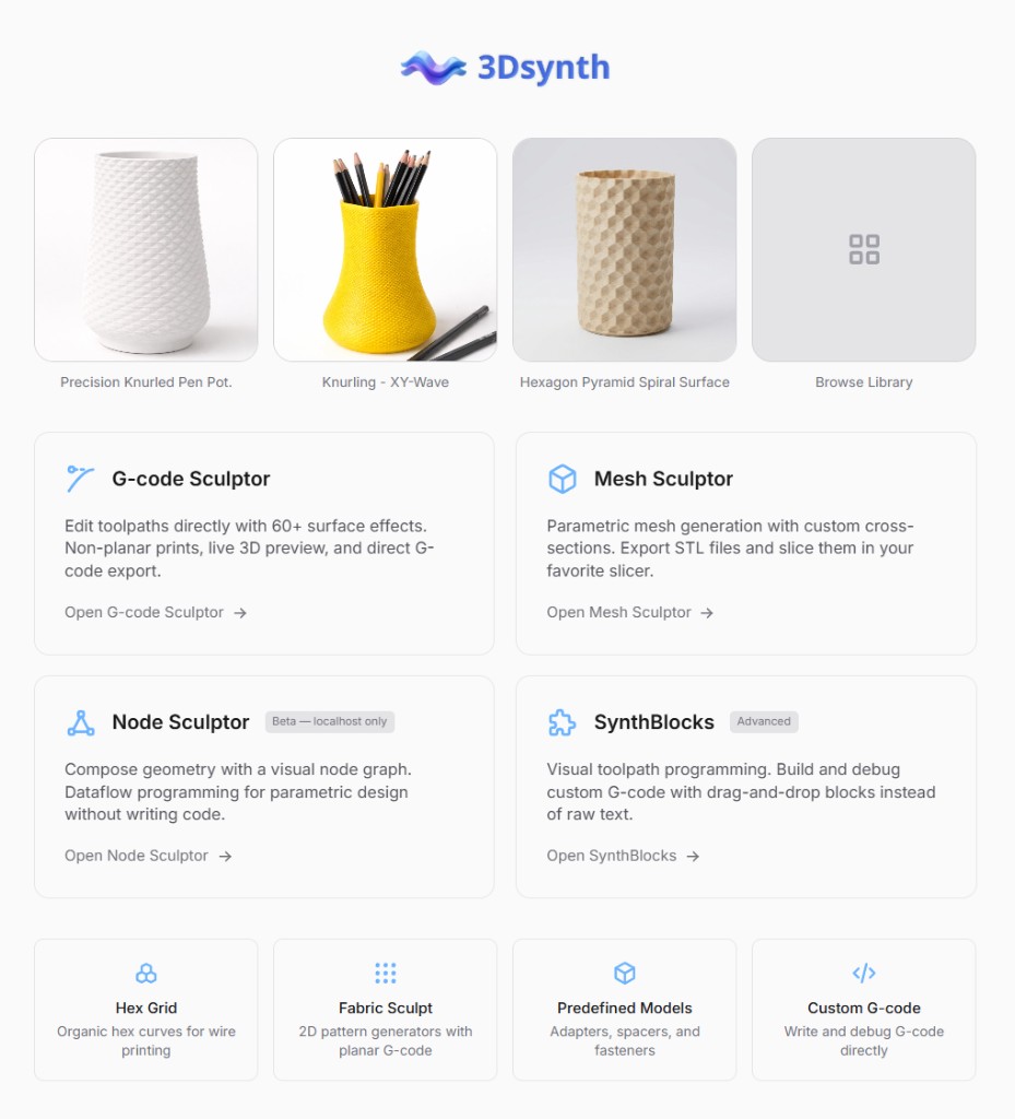
With no project open, this is where you choose a design module. For a first vase-mode print, open G-code Sculptor—the five-step path is on Getting Started.
Main workspace (module open)
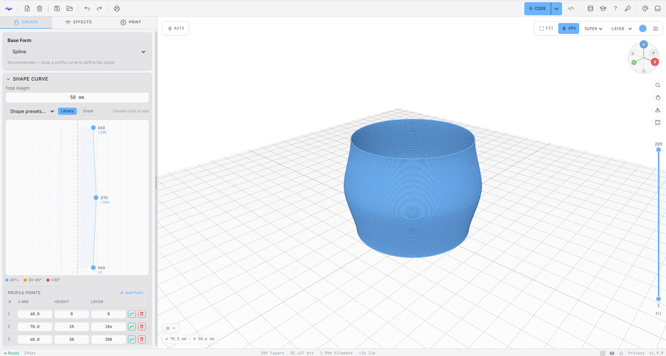
Many modules follow the same rhythm: build a base shape, then stack effects or filters, then preview and export—but the controls differ by module. Terminology for G-code Sculptor (vase mode, profiles, effects stack) is on the G-code Sculptor overview and Getting Started; per-effect detail lives under G-code Sculptor in the sidebar.
Layout at a Glance
Top Toolbar
The toolbar across the top provides global actions:
- Logo — app identity
- Save — save your current project
- Undo / Redo — step through your edit history
- Export — download G-code or 3D models
- Theme Editor — customize app colors
- Inspector toggle — show/hide the G-code Inspector (bottom panel)
- Presets — open the preset browser
- Documentation — open these docs (? icon)
Left Dock (Authoring)
This is where you design the print. It has three tabs at the top:
- Create — your base silhouette (radius vs height), profile point table, and height control.
- Effects — procedural textures and transforms. Order matters: effects are applied top to bottom in the stack; put base texture (e.g. Noise) first and caps (Bottom Cap, Top Cap) last. Plus a growth curve editor. The growth curve scales effect strength from bottom to top (0–100% height); use it to fade effects in or out over the print. See Growth curve for details. Each effect card can be duplicated (copy icon) to clone settings below the original; Ctrl+D also duplicates the selected effect. In Add Effect, hovering an entry shows a documentation preview; ? opens that effect’s doc page.
- Print — printer, material, and nozzle presets that control how G-code is generated.
Main Viewer (Preview)
The viewer shows a real-time 3D preview of the generated path.
Orbit- Left mouse drag
Pan- Right mouse drag
Zoom- Mouse wheel / trackpad scroll
Viewport Overlays
Controls float directly on the viewport:
- Top-left — Auto/Manual update toggle. When in Manual mode, shows "Needs Update" when parameters change. Click it to regenerate. A small readout shows approximate model width (max XY, mm) and height (Z, mm) for the current preview (including on narrow layouts).
- Top-right — Viewer controls pill strip: Fit (F), shade mode CPU / Wire / GPU (T), Quality, View Mode (Layer / Studio / Lamp), color picker, Screenshot.
- Right edge — Viewer layer range slider with editable top/bottom layer inputs. Use it to inspect a specific band of layers (also called “inspect layers”). The same vertical band applies in GPU shade mode as in CPU and Wire; you can set only a top or only a bottom bound with the other side All.
Bottom Panel (G-code Inspector)
The bottom panel is the G-code Inspector (also called the Inspector). Use it to sanity-check output when you tweak settings or add complex effects.
- Look for sudden changes in behavior after adding an effect (a "before/after" moment).
- If generation feels slow, use the Inspector plus the viewer layer range slider to isolate where complexity spikes.
Bottom Status Bar
The very bottom bar is a slim always-visible strip with three zones. Everything here is a quick glance, not a modal workflow — click any interactive element to jump somewhere more detailed.
Bottom status bar zones
Left — Generation status- Shows Ready (green) when the current preview is up to date, or Generating… (yellow pulse) when the worker is building a new preview. A small readout displays the last generation time in milliseconds. Useful for spotting effects that dramatically slow things down.
Center — Print metrics- Live counts for the current preview: layer count, total points, estimated filament usage (m + g), and estimated print time (h:mm:ss). Values update every time the worker finishes a new preview. A dismissible Preview Z ≠ export chip appears on G-code Sculptor when a height-modulating effect (Z-Ripple) is on: the viewport skips collision avoidance; export does not.
Right — Alerts and shortcuts- Warning count (clickable — opens a panel with the full list of warnings), social media links (Instagram, YouTube), and the version number. Click the version to open the full Changelog; click the feedback icon to open Feedback & Bug Reports.
Numeric Controls (Blender-Style)
All numeric parameters in 3dSynth use a Blender-style numeric field: drag horizontally to adjust, click to type a value, and use arrow buttons to nudge. For full details (modifier keys, typing mode, decimal input), see Numeric Controls.
A Typical Workflow
- Create a clean base with the Profile Editor
- Set height and choose your printer/nozzle/material presets
- Add one effect at a time in the Effects Stack
- Verify the result in the viewer (full height + problem layers)
- Export G-code when it's stable and print-safe
Effect layer range
Every effect in the stack can be restricted to a specific height range using Effect layer range (Start/End % on each effect card). This is separate from the viewer layer range slider on the viewport, which only controls which layers are visible in the preview.
Using effect layer range
- Expand an effect card in the Effects Stack
- Use the Start/End range slider at the bottom of the card
- Drag the handles to set where the effect begins and ends (0% = bottom, 100% = top)
Use Cases
- Textured base, smooth top: Apply a pattern effect only to the bottom 50%
- Gradual transitions: Stack multiple effects with overlapping ranges
- Accent details: Add a highlight effect only to a specific band
Visual feedback
When an effect’s layer range is not 0–100%, the effect card shows a visual indicator of the active range. This helps you see at a glance which effects are partial.